Red Theory in Interior Design: How the Color Red Shapes Luxury Interiors
Color plays a powerful role in how a space feels. Certain colors can make a room feel calm and understated, while others create energy and visual impact. In interior design, what many designers refer to as Red Theory focuses on how the color red influences mood, balance, and the overall atmosphere of a space. When used thoughtfully, red can add warmth, depth, and sophistication to luxury interiors.
At Marc Pridmore Interiors, color is never chosen in isolation. Every design decision—from materials to furnishings to lighting—is considered as part of a cohesive vision. Red is often used as a strategic accent within a refined palette, helping create focal points that add richness without overwhelming the room.
Why Red Is Such a Powerful Design Element
Red has long been associated with energy, passion, and confidence. In design psychology, it is known for encouraging engagement and conversation, which makes it particularly effective in gathering spaces such as living rooms, dining rooms, and entertainment areas.
However, red works best when it is balanced with other elements in the space. Texture, scale, natural materials, and lighting all influence how the color is experienced. This is where thoughtful design planning becomes essential. Through our interior design services, our team helps clients incorporate bold color in ways that complement the architecture and elevate the overall environment of the home.
How Designers Apply Red Theory in Luxury Homes
Red theory is not simply about painting a wall bright red. Instead, it focuses on using the color intentionally to guide attention and create a sense of balance within the design.
Accent Pieces That Anchor a Room
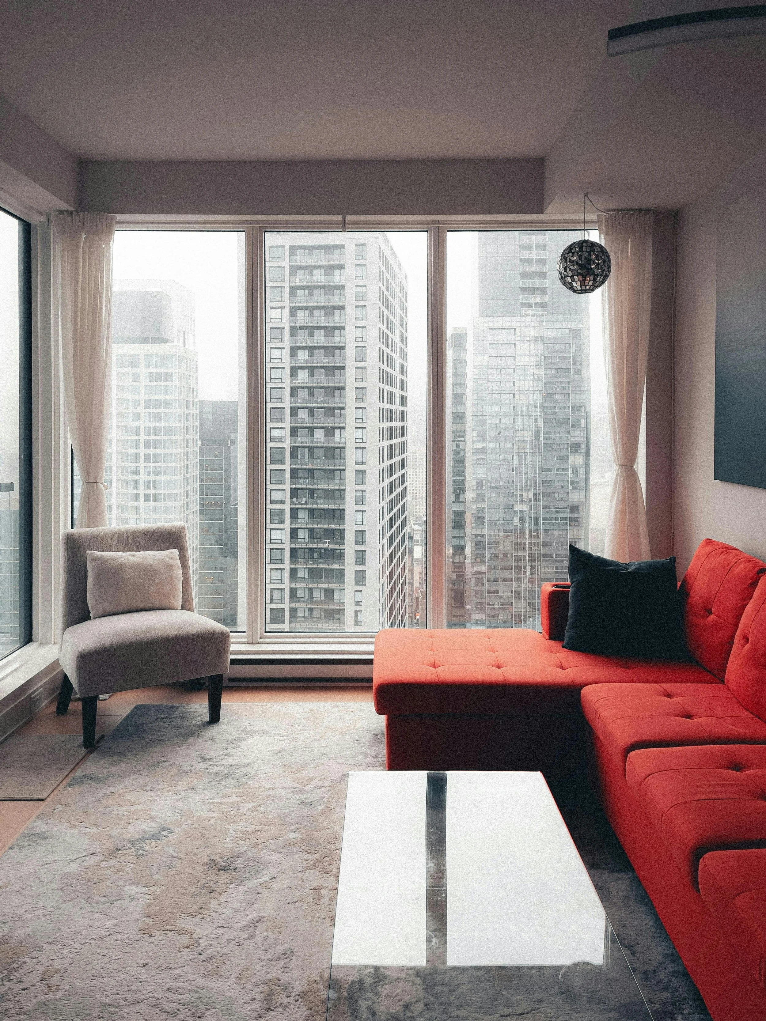
One of the most effective ways to incorporate red is through statement furnishings. A deep red sofa, velvet accent chair, or patterned area rug can act as a visual anchor that grounds the room while adding warmth and character.
Luxury interiors often pair red with neutral palettes such as ivory, taupe, charcoal, or warm wood tones. This contrast allows the color to stand out while maintaining a calm and sophisticated atmosphere. Many homeowners explore these curated furniture pieces when visiting theMarc Pridmore Interiors showroom, where collections of luxury furnishings, lighting, and décor are thoughtfully displayed.
Layering Red Through Textiles and Drapery
Textiles are another elegant way to introduce red into a space. Fabrics such as velvet, wool, and silk bring depth and softness to the color while adding texture to the room.
Window treatments are particularly effective because they introduce color vertically and help shape how natural light interacts with the interior. Our designers often incorporate subtle tones or patterns when designingcustom drapery, ensuring the window treatments enhance the surrounding furnishings and architectural details.
Architectural Details and Artwork
Red can also appear through artwork, decorative objects, and architectural accents. A lacquered console, sculptural art piece, or statement painting can introduce the color in a sophisticated and controlled way.
These moments of color create visual interest and guide the eye throughout the space. You can see how color, materials, and furniture selections work together in completed homes throughout ourinterior design portfolio.
Choosing the Right Shade of Red
Not every red creates the same effect. The tone, saturation, and surrounding materials influence how the color appears within a room.
Some of the most commonly used shades of red in luxury interiors include:
• Deep burgundy for rich, dramatic spaces• Terracotta for warmth and organic character• Rust tones for modern, earthy palettes• Muted brick red for timeless elegance
Lighting also plays a major role. Natural daylight, warm lighting, and cool lighting can all shift how red appears throughout the day. Because of this, designers carefully evaluate color alongside fabrics, finishes, and furnishings before making final selections.
Where Red Works Best in the Home
Red can appear in many areas of the home, but certain rooms benefit most from its warmth and energy.
Living Rooms
Living rooms often benefit from bold accent pieces. A red chair, ottoman, or decorative textile can introduce color while still maintaining a refined palette.
Dining Rooms
Red has historically been used in dining spaces because it creates an inviting atmosphere that encourages gathering and conversation.
Entertainment Rooms and Home Theaters
Entertainment spaces often use deeper, richer tones to create an immersive experience. Layered lighting, textured walls, and dramatic fabrics can bring warmth and sophistication to these environments. A great example can be seen in theMurray Lane Theater interior design project, where color and material choices work together to create a dramatic and welcoming space.
Balancing Red With Neutral Foundations
One of the most important principles of red theory is balance. Red rarely works as the dominant color throughout an entire room. Instead, it is typically layered into a neutral foundation that allows the color to stand out in a refined way.
Designers often combine red accents with:
Soft creams and neutral tones
Natural wood finishes
Warm metals like brass or bronze
Textured upholstery and woven fabrics
This approach ensures the space feels elegant and cohesive rather than overwhelming.
Bringing Thoughtful Color Into Your Home
Incorporating bold color successfully requires careful planning. The right shade, placement, and surrounding materials can elevate a space and create a memorable design statement.
At Marc Pridmore Interiors, color is always part of a larger design strategy that considers furniture, architecture, lighting, and how each space is used every day. Whether redesigning a single room or transforming an entire residence, thoughtful color planning helps create interiors that feel both timeless and personal.